
PyX — Example: graphs/change.py
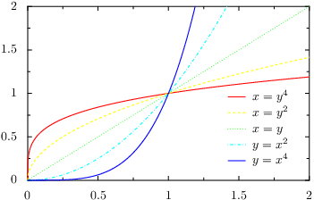
Plotting more than one data set and adding a graph key
from pyx import *

g = graph.graphxy(width=8,
                  x=graph.axis.linear(min=0, max=2),
                  y=graph.axis.linear(min=0, max=2),
                  key=graph.key.key(pos="br", dist=0.1))
g.plot([graph.data.function("x(y)=y**4", title=r"$x = y^4$"),
        graph.data.function("x(y)=y**2", title=r"$x = y^2$"),
        graph.data.function("x(y)=y", title=r"$x = y$"),
        graph.data.function("y(x)=x**2", title=r"$y = x^2$"),
        graph.data.function("y(x)=x**4", title=r"$y = x^4$")],
       [graph.style.line([color.gradient.Rainbow])])
g.writeEPSfile("change")
g.writePDFfile("change")
g.writeSVGfile("change")
Description
In this example we demonstrate how to plot more than one data set in a graph. Furthermore, adding a graph key labelling the data is explained.
In order to display more than one data set, we pass a list of data sets to the plot method of the graph. In the present case, we contruct this list out of three lists of graph.data.function instances. For each data set we also set a title using the corresponding keyword argument of the data class.
For a more colorful output, we pass the color.gradient.Rainbow color gradient to the graph.style.line class. PyX then automatically chooses color spanning the whole range of the rainbow gradient.
If you look at the output, you will notice that not only the colors are cycled through, but also the line style changes. The reason for this behavior is that the default line attributes of the graph.style.line style contain an attr.changelist comprising a couple of different line styles. When you pass additional line attributes, these are appended to the default attributes (this is generally the case in PyX). Consequently, you get a change of both the color and the line style. If you only want to change the color, either pass the desired line style explicitly, i.e., use
graph.style.line([style.linestyle.solid, color.gradient.Rainbow])
or clear a previous setting of the line style using the clear attribute of the corresponding class:
graph.style.line([style.linestyle.clear, color.gradient.Rainbow])
It is also possible to call the plot method several times. Note that the changing of the styles is also performed when the style instances are used on several plot commands within the same graph as long as the same set of style instances are passed at the plot method calls.
Finally, when plotting more than one data set you might want to label them in your graph. We already have passed titles identifying each data set, so we only have to add a graph key. This is done by passing a graph.key.key instance as the key keyword argument to the graph. Usually, you only need to specify the position of the key using the pos argument of the graph.key.key constructor. The syntax should be self-explaining; here we use br to put the key at the bottom-right position of the graph. In order to save some space, we furthermore decreases the distance between the key entries a little bit by passing a value of 0.1 to the dist argument.