
PyX — Examples: Basic plotting
One of PyX's major strengths are its graph-plotting capabilities. PyX offers you a flexible system which, while providing sensible defaults, allows you to customize almost every aspect of the graph output. Such a flexibility comes at a price, though: you need to learn at least a little bit about the different components playing together in order to produce a graph. In this section, we try to give you a gentle introduction to one component after the other by by demonstrating how to plot various kind of data (from a file, a function mapping x values to y values, a parametric function). Furthermore, we explain how to do simple modifications to the axes of the graph and show how to add a graph key.
After having gone through the introductory examples you should be able to freely go through the following sections of the examples, which examples will be devoted to a more detailed explanation of PyX's graph-plotting facilities. In particular, you might want to learn about the customization of the graph axes (see section Graph axes), about further available graph styles (see section Graph styles) and about bar graphs (see section Bar graphs).
Overview for this section
Plotting data contained in a file
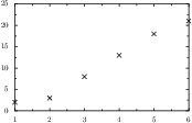
This example shows how to draw a graph representing data stored in a file. more ...
Plotting a function graph
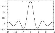
Here, we explain how to plot the graph of a real-valued mathematical function of a single real parameter. more ...
Plotting data contained in one or more lists
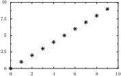
Here, we explain how to plot data which has been calculated before and which is available in a list. more ...
Plotting a parametric function
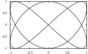
This example shows how to use a paramfunction as a data source for a graph. paramfunction defines a parameter variable name given as a string in the first argument, a minimal and a maximal value given as the second and third argument and an expression string as forth argument.
more ...
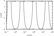
Using a logarithmic axis and defining the axis range and its label
Sometimes, you have to visualize rather pathological funtions containing divergencies and/or varying over a large parameter range. This is best done using an appropriate axis. Here, we show a simple example how to do this with PyX. more ...
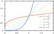
Plotting more than one data set and adding a graph key
In this example we demonstrate how to plot more than one data set in a graph. Furthermore, adding a graph key labelling the data is explained. more ...
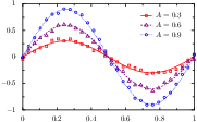
Joing multiple datasets for grouping in the graph key
If you want to group datasets in the graph key, e.g., to compare simulation results with measurement data more ...

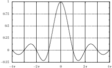
Drawing a graph with grid lines
The drawing of grid lines is performed by the axis painters of the graph. more ...
Shortcut for accessing graph-component attributes
Changing attributes of graphs requires one to set attributes of various graph components. In order to simplify this, PyX provides a shortcut in the constructors of these components. more ...