
PyX — Example: graphs/join.py
Joing multiple datasets for grouping in the graph key
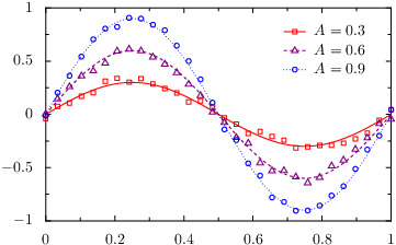
from pyx import *

g = graph.graphxy(width=8, key=graph.key.key())

As = [0.3, 0.6, 0.9]

d = [graph.data.join([graph.data.function("y_a(x_a)=A*sin(2*pi*x_a)", context=dict(A=A)),
                      graph.data.file("join.dat", x_b=1, y_b=i+2)],
                     title=r"$A=%g$" % A)
     for i, A in enumerate(As)]

attrs = [color.gradient.RedBlue]

g.plot(d,
       [graph.style.pos(usenames=dict(x="x_a", y="y_a")),
        graph.style.line(attrs),
        graph.style.pos(usenames=dict(x="x_b", y="y_b")),
        graph.style.symbol(graph.style.symbol.changesquare, symbolattrs=attrs, size=0.1)])

g.writeEPSfile()
g.writePDFfile()
g.writeSVGfile()
Description
If you want to group datasets in the graph key, e.g., to compare simulation results with measurement data or some approximate results with results from a more detailed calculation, you can pass a list of datasets to the graph.data.join class.
When doing so, you have to assign unique names to the corresponding datasets. In the example, we have used x_a and y_a as well as x_b and y_b as names. Subsequently, one has to tell the graph style which data columns—identified by the given name—it has to plot. This can be done by inserting graph.style.pos instances before the respective graph style. By passing a dictionary to the usenames argument, one specifies the mapping from the data columns to the corresponding graph axes x, y, x2, and so on.
When using the standard names x, y, etc. for the data columns, as is done in most cases, PyX does insert the graph.style.pos instance mapping those data columns to the axis with the same name, automatically.